Frontend Without CSS
- #frontend
- #ui
- #tailwind
- #dev
- #indie
How to build web interfaces when you’re a backend dev.
If you were making little websites back in the Paleozoic era, you may remember there used to be this neat UI framework called Bootstrap. It made prototyping dramatically easier and let you throw together interfaces at speed. That era is gone now. Tailwind is the king.
🧱 TailwindCSS
It’s a utility-first CSS framework. If you’ve been living in a bunker or just wisely keeping your distance from frontend, here’s the short version: we no longer write custom styles, we just scatter utility classes all over the HTML.
Before:
<style>
    .btn {
        background-color: blue;
        color: white;
        padding: 10px 20px;
        border-radius: 5px;
        font-weight: bold;
    }
</style>

<button class="btn">
    I am a blue button
</button>
After:
<button class="bg-blue-600 text-white font-bold py-2 px-4 rounded">
    I am a blue button
</button>
We’ve been using it on the main project for quite a while. The nice part is that you no longer need separate CSS files: you just edit the views and that’s it. No suffering through complex CSS class hierarchies, no switching between files, no setting up a CSS toolchain for every tiny project.
Colors and base sizes are defined in the theme config once and then reused across the project. For example, bg-blue-600 is the right shade of blue, and text-xl means “big text.” All the hex values, rgb codes, and pixel sizes are moved into config and can be changed easily.
Traditional CSS classes had to be thrown out because, according to the creator of Tailwind, they only make everything worse. A controversial claim, of course, but fine, whatever.
Working with views did become a bit more convenient, but there is a downside: there are a lot of utility classes on every element, and the views become an absolute landfill. It starts looking like this:
<div class="max-w-sm bg-white rounded-2xl shadow-xl overflow-hidden border border-gray-200 hover:shadow-2xl transition-all duration-300">
    <img class="w-full h-48 object-cover" src="...">
    <h2 class="text-2xl font-semibold text-gray-800 hover:text-blue-600 transition-colors duration-200">
        Majestic Landscape
    </h2>
    <p class="text-gray-500 text-sm">
        A breathtaking view captured during golden hour.
    </p>
    <button class="mt-4 self-start bg-blue-600 text-white px-5 py-2 rounded-xl text-sm font-medium hover:bg-blue-700 focus:outline-none focus:ring-2 focus:ring-blue-400 focus:ring-offset-2 transition-all">
        Learn More
    </button>
</div>
Views turn back into spaghetti, and reading them becomes miserable again. Tailwind has a solution for this, too.
No, not an ultrawide monitor. Repeating style sets can be grouped with @apply and then used like this:
.btn {
    @apply mt-4 self-start bg-blue-600 text-white px-5 py-2 rounded-xl text-sm font-medium hover:bg-blue-700 focus:outline-none focus:ring-2 focus:ring-blue-400 focus:ring-offset-2 transition-all;
}
Does this remind you of anything? Yes, we’re writing classes again and have not escaped them at all. But now at least the button can look like a button:
<button class="btn">
    Learn More
</button>
So now, to build UI components and reuse them across the project, we need to create these little class “groups”… for the entire UI… Sounds suspiciously like nonsense. Because it is. And this is where we arrive at the glorious realization that we are reinventing Bootstrap all over again.
Which raises the obvious question: is there a “Bootstrap on Tailwind”? Yes. There is.
🎨 DaisyUI
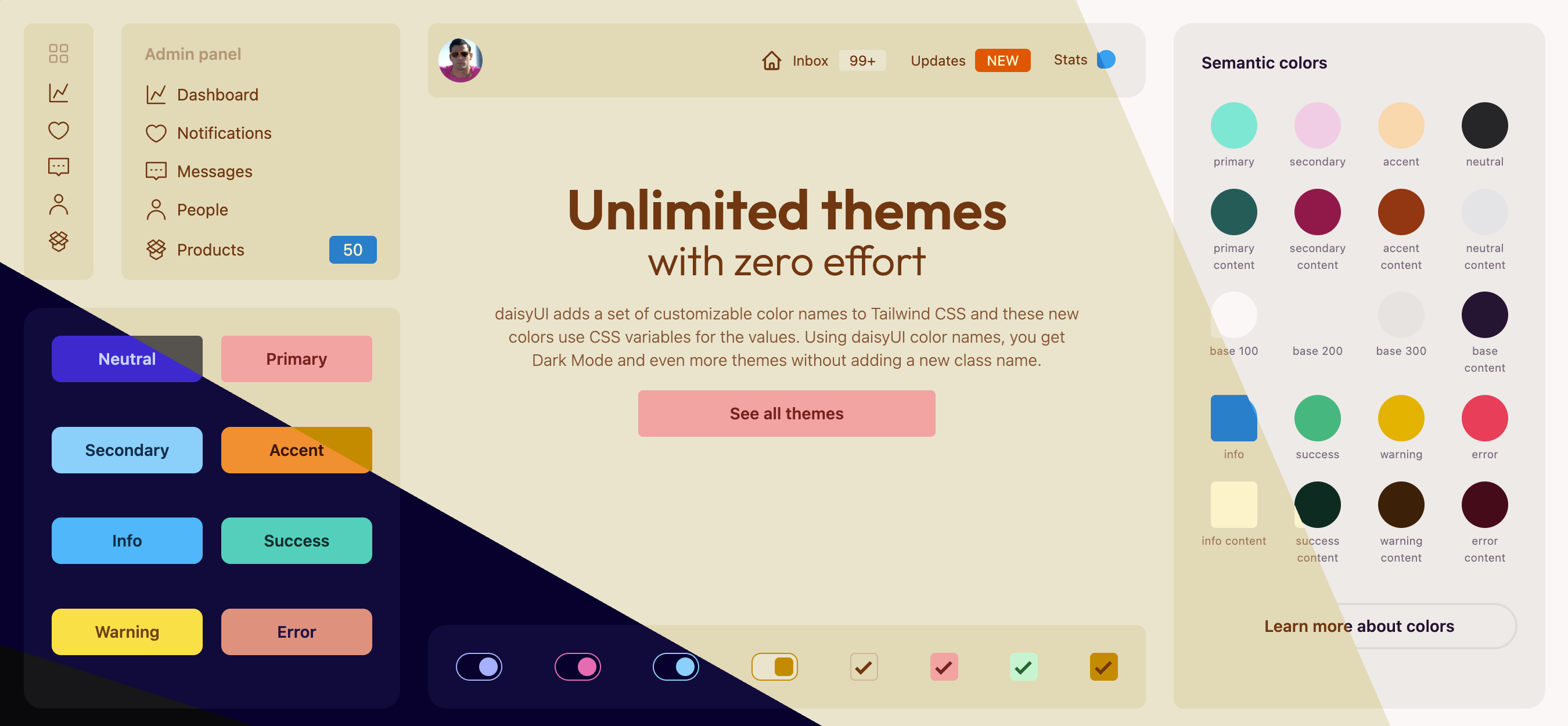
This is basically Bootstrap for Tailwind. Components, theming, a nice visual style right out of the box. Still based on utility classes, just less painful.
<button class="btn btn-primary">
    Click me
</button>
You can mix it with Tailwind: customize if you want, or if you don’t, just throw together an interface quickly and call it a day. Saves time.
Which naturally leads to another question: why not just use Bootstrap then? Well… excellent question 😅. Because “just Bootstrap” becomes limiting pretty fast. If you ever need something outside its standard classes, you’ll have to write CSS. And that kills the vibe. Also, Bootstrap is more dead than alive these days - I haven’t seen it in real projects for years, unlike Tailwind, which is currently everywhere.
Evolution has completed another loop and landed exactly where it started. Sadly, this problem seems embedded at the DNA level, and until something truly beautiful happens to HTML itself, all we can do is hide the ugliness in different corners.
Still, the problem is solved: we don’t write CSS, we use modern tools, and we can slap together UI fast. Hard to complain too much.
And then we also need…
🧩 Icons
Without icons, interfaces look empty. But in the kingdom of icons, nothing revolutionary has happened. SVG is still shoved into views in huge chunks, or if you’re lucky, loaded from a file.
These two libraries are free and have everything you need for MVPs and prototypes. With Heroicons, you just grab the SVG you want. Lucide can also be used through attributes:
<i data-lucide="menu"></i>And that’s about it. You are now fully equipped to churn out little menus and buttons quickly and with minimal ceremonial suffering.